
Wednesday, 21 December 2011
Sarah's Evaluation Question 1
Media Eval1
Videos reference in Scribd.
The Saturdays' 'Up' (Unable to embed)
http://www.youtube.com/watch?v=gf2vwAp2XVU
Tuesday, 20 December 2011
Monday, 19 December 2011
Sunday, 18 December 2011
Saturday, 17 December 2011
Friday, 9 December 2011
Sarah's Evaluation Question 1
In what ways does your media product use, develop or challenge forms and conventions of real media products?
Our video is a mixture of many different video styles, mainly illustration with some features of disjunction. This in it's self breaks conventions of videos which normally extensively stick to the features of just one of these styles. Our video also included a small amount of performance, with our solo artist lip syncing and playing the main audible instrument in the song. In our case this instrument was a guitar. An example similar to ours is Miles Kane's Rearrange video as we see him alone playing the guitar, although a guitar is obviously not the only instrument. This idea of performance is one used greatly across the music industry and not just within the indie genre.
Two vital standard conventions of all music videos are multiple locations and a variety of shots. This is something we did not do. Our reasoning for this was because the steady movement and lack of quick cutting would fit with the tempo of the song. This could have left the overall product looking almost boring however due to the movement and action we included I feel the low number of shots and cuts was not an issue.
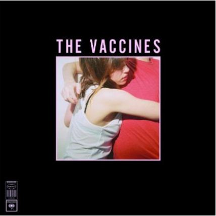
My digipak generally broke conventions. For example many albums included an artist photo, whether on the cover or within the case. I was unable to do this and have substituted this convention for object photos, as The Vaccines did. I also broke the convention of having the artist name on the front cover. This could possibly mean that the audience is put off as most buy an album depending on who the artist is and in this case they would be completely unaware of who the album is by. One popular convention of the indie genre, most famously done by Vampire Weekend, it did meet was to have a very centred image with a large border as the front cover, with any text in a simple, bold font. This is a very recognisable and impacting style for a cover.
Our video is a mixture of many different video styles, mainly illustration with some features of disjunction. This in it's self breaks conventions of videos which normally extensively stick to the features of just one of these styles. Our video also included a small amount of performance, with our solo artist lip syncing and playing the main audible instrument in the song. In our case this instrument was a guitar. An example similar to ours is Miles Kane's Rearrange video as we see him alone playing the guitar, although a guitar is obviously not the only instrument. This idea of performance is one used greatly across the music industry and not just within the indie genre.
Two vital standard conventions of all music videos are multiple locations and a variety of shots. This is something we did not do. Our reasoning for this was because the steady movement and lack of quick cutting would fit with the tempo of the song. This could have left the overall product looking almost boring however due to the movement and action we included I feel the low number of shots and cuts was not an issue.
My digipak generally broke conventions. For example many albums included an artist photo, whether on the cover or within the case. I was unable to do this and have substituted this convention for object photos, as The Vaccines did. I also broke the convention of having the artist name on the front cover. This could possibly mean that the audience is put off as most buy an album depending on who the artist is and in this case they would be completely unaware of who the album is by. One popular convention of the indie genre, most famously done by Vampire Weekend, it did meet was to have a very centred image with a large border as the front cover, with any text in a simple, bold font. This is a very recognisable and impacting style for a cover.
Evaluation Question Technologies
Question 1 - scribd document
Question 2 - photoshop article
Question 3 (joint) - prezi of our feedback
Question 4 (joint) - video of our technologies with a voice over
We are possibly thinking about uploading all our questions onto a joint wix website to include another technology for our evaluations.
Question 2 - photoshop article
Question 3 (joint) - prezi of our feedback
Question 4 (joint) - video of our technologies with a voice over
We are possibly thinking about uploading all our questions onto a joint wix website to include another technology for our evaluations.
Liana's Evaluation Question 1 Draft
In what ways does your media product use, develop or challenge forms and conventions of real media products?
Our music video used the device of instruments, in our case we used a guitar, that coincided with the song played by our artist, a convention which is usually used in music videos of the same genre. It connects the visuals with the audio more and makes the artist seem more talented, as they can also play their own music rather than just singing it. The video also focuses mainly on the artist, with some extra characters included, an aspect which is usually seen in 'indie' music videos, as they are more likely to focus on the performance, such as Mumford & Sons - Little Lion Man.
Our video was mainly an illustration video, as some of our visuals coincided with our song. However, most illustration music video focus on the lyrics throughout the entire song, creating a storyline that links in with the audio, whereas our video only includes some links to the song, meaning it isn't completely a illustration video, as it also includes unrelated visuals.
The style for both our video and my digipak were very similar and kept in with the stereotypical indie look. Although our artist had a slightly more original style than the stereotypical look, as he included some of his own style, such as his skull t-shirt. Sarah wore stereotypical indie clothes which helped to promote the genre of music through my digipak, something which real media products also promote, for example R&B covers usually include some form of black and white effect, as well as the stereotypical R&B style, an element which is linked to the R&B genre.
My digipak could challenge the conventions of a real media product because it does not include any images of our artist, an aspect which is usually used for CD's and digipaks. I did not include any images of the artist as from my feedback and my own opinion, I believe the images of Sarah which I used worked better than lots of images of the artist would have.
Overall, I feel that my media products where quite similar to real media products because they included elements that are included in nearly all indie music videos, such as the artist lip syncing and playing the guitar. I think that my digipak and magazine advert weren't as similar to real media products as I used no photos of our artist, whereas nearly all media products, not just from the indie genre, include some images of wither the artist or the band.
Wednesday, 7 December 2011
Liana's Evaluation Question 2 Draft
How effective is the combination of your main product and ancillary texts?
I think that the combination of both the main product and my ancillary texts is quite effective as I tried to keep a similar theme throughout, making the two link together well. In our music video the location throughout was a field and therefore I took all of my digipak pictures in a field to keep a similar location, I also included images of the sky which was featured in our music video when our artist was lying down and looking upwards. I believe that this would make my ancillary texts and main product work effectively together because the target audience would be able to link the video with the digipak, therefore they would be more likely to recognise either element and the artist who it was for. Although I originally wanted my magazine advert to keep in with the location of a field, I decided against it as I thought it would become too monotonous. Therefore, I kept a similar theme in the fact that I used an image of nature, but one of the sun rising over the sea, to symbolise the beginning of our artists career starting with his first album.
Both the video and ancillary texts are simplistic which meant that the information on my ancillary texts would be easily accessed and for the video the visuals would match the pace of the song. I think that the fact that everything was simplistic may have been a little boring, but it looked effective as everything tied in well with one another and made the combination of the two elements quite unique. I didn't use images of the artist on my ancillary tasks, instead using an image of an extra character from the video, who the artist dances with, for my digipak. In my opinion this worked well with the video, as it made more of a story between the two characters, as that character was singled out from the three extra female characters, giving the impression that she is the more important one. I think that it also makes the digipak a little different, as most digipaks would include an image of the artist somewhere, usually on the front cover, whereas mine doesn't. However, this could be considered as confusing, as the target audience wouldn't realise that it was a product from the artist as there are no visual elements that link the product to him, besides his name.
Overall, I believe that the combination of my ancillary tasks and video worked effectively together as they were all quite striking in the sense that they were so simplistic, as it is not something that would be expected in the music industry. I also think that the effectiveness of the two pieces was emphasised by only having the artist shown in the music video and not on my ancillary tasks because my digipak and magazine advert would create interest in the song for my target audience, but they wouldn't know what the artist looked like and would consequently be interested to find out so they would watch the video.
Tuesday, 6 December 2011
Evaluation Question 3 Draft
What have you learned from your audience feedback?
Pitch Feedback
'We like the factor that the audience are both male and female as we expect that it would be difficult to please both. However we think you should consider making the age range wider. We like the idea of vintage and muted colours.'
'I liked the images, but there wasn't much there to get an idea of what you're trying to do. You said "incredibly indie", but as much as others like to say otherwise that's actually a broad selection of clothes and styles. I think you should probably try and be a bit more accurate with what their style is, but other than that it was okay'
'From all your photos you can tell your style completely and you obviously have a very specific idea about the artist- which is definately going to make things easier in the long run! The muted colours and 'vintage' look fit perfectly with the stereotypically indie ideas and i think the whole thing will fit with the chosen genre seemlessly. thought about widening the age range a bit though? (this is possibly the only slight fault I could find..)'
'I like the layout of your pitch! It's easy to view. All of your ideas fit together really well, and the name of your artist is cool too :)'
From the feedback we received at the beginning of our planning it was apparent that our idea and genre for the music video was well liked, especially the idea of including a vintage aspect to the video either through the artist or the location. Most of the criticism was for our target audience, we were advised to widen the age range as to gain more interest in our video, a factor which we did change.
Music Video Draft
'I think that the quality of the footage is really good, more effective when the background is more blurred, such as the footage around 1:40, which looks really professional, especially with the slight hand held camera. The effects of the colours look really effective, I think you should incorporate more of that so that theres a continuity maybe. I think that constructive criticismwise, you should try and match up the lip syncing a bit tighter, also, the slight jump cuts between similar shots could maybe be more continuous or change the location? I think that the video has a really good raw quality, and after tightening it up abit, would look brill.'
'Firstly, I think that the artost fits the song a lot more when he's just wearing the shirt and tie- The hooide looks a little bit too scruffy! I also like the pink/green effects as it make sit look interesting- however I do agree with maybe changing the artist as Sam just doesn't fit with the genre so much. I like the shots that he walks across without the camera panning too much- ot makes it look very professional, and him looking into the camera quite a lot really works. As long as the editing is maybe a bit more fluent and flowing this is reeeeeeally good!'
'It was nice, but the camerawork was wobbly and there seemed to be too many long shots for the most part - they also seemed too long, and that by trying to make it all a continuous piece of action it makes it seem too... off. All the action taking place in the same place adds to that feel, and with that being the only surreal aspect to the video (besides the colour shifts) it just seems out of place. The colour shifts also don't seem very appropriate. It was nice though, I thought.'
Overall the feedback we received in the comments was really positive, as people liked our idea and the effects we used in the video. The way the artist acts in the video was also praised, although it was suggested that we change the artist which we did. The blurred backgrounds were also thought to look professional as were the shots were the artist walks along without the camera panning a lot, except the footage was wobbly and there was thought to be too many long shots, which we tried to counteract in our final video by using a different tripod and include more close ups. Another piece of advise we received was that our editing needs to be more fluent and tighter, something that was a problem because of the way we filmed our shots, but we managed to avoid repeating this in our final video by filming everything in chronological order.
Digipak Draft
'I like the continuous font used, it's clear and bold. There's a lot of colour used which I like a lot, but as I think of 'Peaceful People' I think of a softer more pastel coloured scheme. I like the landscape type shots used. Is there an image you're using on the disc tray part? Maybe just annotate that if you haven't already. Looks really good! :)' - Liana's draft
'I like the similar images used on the inside of the digipak, it looks neat and obviously symmetrical with a change of detail that would attract attention. The block font looks good, maybe on the very back at the bottom of the track list, have some small print so it looks more 'real'? Just an idea :)' - Sarah's draft
'I think it's alright, wondering why the disk tray is completely empty though, and what the panels next to it actually are is eluding me.' - Sarah's draft
The feedback I (Liana) received for my digipak draft I was really pleased with, as my idea was well received. The font was easy and clear to read and continuous throughout the whole digipak, an aspect that was liked by our target audience. For my colour scheme it was suggested that I use more softer colours to coincide with the idea of peace, so I tried to incorporate this in my magazine advert by using the image of the sun rising. For the disk tray, I decided to use the same image of the sky as I did for my track list, as I thought the continuity of the image would look good.
Sarah:
To begin with the feedback was very positive commending my layout and typography, which was the main focus of my digipak. I liked the suggestion of including small print to create a more genuine look and added this on my final draft. The next comment I received was more negative suggesting that the digipak was extremely unclear. In the final I did take this into consideration and simplified my inside pages, making the content far clearer.
Final Music Video
Class Feedback
Here are some points that were consistently given to us in our feedback:
Peer Feedback
 I put our final draft on Tumblr. but received little feedback, mostly likely due to my lack of popularity. My next move was to share the video on Facebook. The two comments it received were quite positive. There were two main concern they flagged up; firstly was the issue with lip-syncing, something that Liana and I also thought was a problem, and secondly they both suggested that Joe looked a bit 'clueless', an obvious visual issue. We now know that for lip syncing the artist must create clearer mouth movements, which will increase the effectiveness and realism of the artist lip syncing.
Pitch Feedback
'We like the factor that the audience are both male and female as we expect that it would be difficult to please both. However we think you should consider making the age range wider. We like the idea of vintage and muted colours.'
'I liked the images, but there wasn't much there to get an idea of what you're trying to do. You said "incredibly indie", but as much as others like to say otherwise that's actually a broad selection of clothes and styles. I think you should probably try and be a bit more accurate with what their style is, but other than that it was okay'
'From all your photos you can tell your style completely and you obviously have a very specific idea about the artist- which is definately going to make things easier in the long run! The muted colours and 'vintage' look fit perfectly with the stereotypically indie ideas and i think the whole thing will fit with the chosen genre seemlessly. thought about widening the age range a bit though? (this is possibly the only slight fault I could find..)'
'I like the layout of your pitch! It's easy to view. All of your ideas fit together really well, and the name of your artist is cool too :)'
From the feedback we received at the beginning of our planning it was apparent that our idea and genre for the music video was well liked, especially the idea of including a vintage aspect to the video either through the artist or the location. Most of the criticism was for our target audience, we were advised to widen the age range as to gain more interest in our video, a factor which we did change.
Music Video Draft
'I think that the quality of the footage is really good, more effective when the background is more blurred, such as the footage around 1:40, which looks really professional, especially with the slight hand held camera. The effects of the colours look really effective, I think you should incorporate more of that so that theres a continuity maybe. I think that constructive criticismwise, you should try and match up the lip syncing a bit tighter, also, the slight jump cuts between similar shots could maybe be more continuous or change the location? I think that the video has a really good raw quality, and after tightening it up abit, would look brill.'
'Firstly, I think that the artost fits the song a lot more when he's just wearing the shirt and tie- The hooide looks a little bit too scruffy! I also like the pink/green effects as it make sit look interesting- however I do agree with maybe changing the artist as Sam just doesn't fit with the genre so much. I like the shots that he walks across without the camera panning too much- ot makes it look very professional, and him looking into the camera quite a lot really works. As long as the editing is maybe a bit more fluent and flowing this is reeeeeeally good!'
'It was nice, but the camerawork was wobbly and there seemed to be too many long shots for the most part - they also seemed too long, and that by trying to make it all a continuous piece of action it makes it seem too... off. All the action taking place in the same place adds to that feel, and with that being the only surreal aspect to the video (besides the colour shifts) it just seems out of place. The colour shifts also don't seem very appropriate. It was nice though, I thought.'
Overall the feedback we received in the comments was really positive, as people liked our idea and the effects we used in the video. The way the artist acts in the video was also praised, although it was suggested that we change the artist which we did. The blurred backgrounds were also thought to look professional as were the shots were the artist walks along without the camera panning a lot, except the footage was wobbly and there was thought to be too many long shots, which we tried to counteract in our final video by using a different tripod and include more close ups. Another piece of advise we received was that our editing needs to be more fluent and tighter, something that was a problem because of the way we filmed our shots, but we managed to avoid repeating this in our final video by filming everything in chronological order.
Digipak Draft
'I like the continuous font used, it's clear and bold. There's a lot of colour used which I like a lot, but as I think of 'Peaceful People' I think of a softer more pastel coloured scheme. I like the landscape type shots used. Is there an image you're using on the disc tray part? Maybe just annotate that if you haven't already. Looks really good! :)' - Liana's draft
'I like the similar images used on the inside of the digipak, it looks neat and obviously symmetrical with a change of detail that would attract attention. The block font looks good, maybe on the very back at the bottom of the track list, have some small print so it looks more 'real'? Just an idea :)' - Sarah's draft
'I think it's alright, wondering why the disk tray is completely empty though, and what the panels next to it actually are is eluding me.' - Sarah's draft
The feedback I (Liana) received for my digipak draft I was really pleased with, as my idea was well received. The font was easy and clear to read and continuous throughout the whole digipak, an aspect that was liked by our target audience. For my colour scheme it was suggested that I use more softer colours to coincide with the idea of peace, so I tried to incorporate this in my magazine advert by using the image of the sun rising. For the disk tray, I decided to use the same image of the sky as I did for my track list, as I thought the continuity of the image would look good.
Sarah:
To begin with the feedback was very positive commending my layout and typography, which was the main focus of my digipak. I liked the suggestion of including small print to create a more genuine look and added this on my final draft. The next comment I received was more negative suggesting that the digipak was extremely unclear. In the final I did take this into consideration and simplified my inside pages, making the content far clearer.
Final Music Video
Class Feedback
Here are some points that were consistently given to us in our feedback:
- simple storyline fits the song well
- the location looks good and works well
- the artist was a good choice as he compliments the song
- the visuals (mainly the props) were interesting
- slightly shaky camera in some places
- the artist does look awkward in some shots
- the artists style fits the genre well
- the ending works well
- good lip syncing/better lip syncing needed in some parts
- the shot of the clouds looks good
- good use of shots/some shots were too long
- the walking shots work but can be slightly jumpy
Peer Feedback

Friday, 2 December 2011
Evaluation Question 4 Draft
How did you use media technologies in the construction and research, planning and evaluation stages?
- Canon 500DSLR camera - construction stage: we used this to film all of our video, both the draft and the actual work, as well as taking pictures of our artist and other elements that were important in our planning stage i.e. location.
- TP30 Miranda Titan tripod - construction stage: we used this to film our actual video, as the tripod we used for the draft didn't fit the camera we were using to film and therefore made the footage for our draft wobbly.
- Tripod (school) - construction stage: we used this to film our draft music video, but as it made our footage wobbly we didn't use it for our final video.
- MacBook Pro - construction, research, planning stage: Sarah's MacBook was very useful as it allowed the two of use to do research into our genre of music together, as well as the planning of our video. We also used iMovie on the Mac to edit our music video, meaning it was an important part of our construction stage.
- iMovie - construction stage: we decided to use iMovie to edit our video, as it was more convenient because we could work out of school and it is also considered to give better results as it is easier to use than other editing software.
- scribd - research and planning stage: Scribd was mainly used to present research about our target audience and music genres and to show our shot list. Using Scribd meant that all the information was shown clearly.
- youtube - research and planning stage: Youtube allowed us to embed music videos that we liked and consequently help us to decide on our genre of music. It also let us decide what elements from other videos that we could include in our own video.
- Photoshop - construction stage: This was used to create the draft and final versions of our digipaks and magazine adverts, as well as editing the still images of our actor and the sky used in our video.
- iPhone 4 - construction and planning stage: Sarah's phone was mainly used to take images of props and locations whilst we were outside filming our video, as the camera on her phone is better than mine, meaning we have clearer images.
- iPhone 3GS - planning stage: My phone was used to blog off when we had any new ideas or problems as it allowed us to post on the go.
- blogger - construction, research, planning and evaluation stage: This is where all our changes, ideas, research, planning, draft pieces, final pieces and evaluation of our work was uploaded to. It also let us give feedback to other media students and receive our own feedback for peers.
- scanner - planning and evaluation stage: A scanner was used to upload our storyboard and Sarah's evaluation notes of our draft video, as it was quicker than typing up all the points and meant that our storyboard was on our blog twice, as the images and in the video which showed how our video would pan out.
- tumblr - research, planning and evaluation stage: Tumblr was very useful to gain images which fitted in with our genre and also gave use an idea of how we would like our artist to look. We also used tumblr to gain feedback for our video.
- tubechop - research stage: We tubechoped clips of music videos we liked to emphasise which points in a certain video we would liked or were thinking of including to our own video.
- slideshare - evaluation stage: This is one of the technologies that were used for the evaluation questions.
- animoto - research and planning stage: This was useful to show all the images and text that were revelant to our music genre and helped us to plan what we wanted to include in our video.
- Safari - construction, research, planning and evaluation stage: This gave us access to everything we needed to create our entire project.
- Facebook - evaluation stage: We posted our video onto facebook to gain feedback for our evaluation from people in our target audience.
- Twitter - research and planning: Twitter let us gain interest in our artist and feedback about whether our artist had the right sort of look and personality.
- Prezi - evaluation stage: This is one of the technologies that were used for the evaluation questions.
Thursday, 1 December 2011
Sarah's Draft Evaluation Question 2
How effective is the combination of your main product and ancillary texts?
My main product and ancillary texts can not be combined, as they unfortunately share no obvious link. Nether the less I feel that they still work well against each other. The shared simplicity of the three products is their greatest tie. I feel using minimalistic colours and images, helped to reflect the minimal features and slow tempo of our video.
I had originally planned to use artist photos within the pages of my digipak, which would have made a useful connection as the audience could then recognise the artist. However I was unable to do this at the time of production and instead used object photos. I feel though these perhaps worked better as they allowed me to demonstrate more creative elements and skills in my work. Also these two images provided a shared type of location to my main product, as all three were 'shot' outside in fields.
My two ancillary texts are extremely effective together, as I designed them to be. The choice to put the digipak's front cover image on the advert was right as it provided a clear link between the two ancillaries and it meant if the audience saw the advert they would then recognise the album. I also used Helvetica across both products, another feature that would hopefully be memorable for an audience. Another graphological feature I continually used in both was the colour scheme. The background for the inside pages of my digipak and adverts used the same colour cream. Similarly for the text I carried on using the black on each product.
The Vaccines' first album, 'What Did You Expect From The Vaccines', presented it's products in the same way. The album cover image was the main image on the advert, much like mine, creating a clear link between the product and it's advertisement. Also like my ancillary products the font usage was continuously, creating another recognisable link for the audience.
 However the video for their first single, 'Wreckin' Bar (Ra Ra Ra), has no link at all. This extremely fast performance video purely features the band, who are often distorted. The location is almost fun fair like with rows of small incandescent bulbs creating a dark visual, even this is extremely opposite to the digipak photo, which is extremely well lit. Although there are no obvious connections the three products work well.
My main product and ancillary texts can not be combined, as they unfortunately share no obvious link. Nether the less I feel that they still work well against each other. The shared simplicity of the three products is their greatest tie. I feel using minimalistic colours and images, helped to reflect the minimal features and slow tempo of our video.
I had originally planned to use artist photos within the pages of my digipak, which would have made a useful connection as the audience could then recognise the artist. However I was unable to do this at the time of production and instead used object photos. I feel though these perhaps worked better as they allowed me to demonstrate more creative elements and skills in my work. Also these two images provided a shared type of location to my main product, as all three were 'shot' outside in fields.
My two ancillary texts are extremely effective together, as I designed them to be. The choice to put the digipak's front cover image on the advert was right as it provided a clear link between the two ancillaries and it meant if the audience saw the advert they would then recognise the album. I also used Helvetica across both products, another feature that would hopefully be memorable for an audience. Another graphological feature I continually used in both was the colour scheme. The background for the inside pages of my digipak and adverts used the same colour cream. Similarly for the text I carried on using the black on each product.
The Vaccines' first album, 'What Did You Expect From The Vaccines', presented it's products in the same way. The album cover image was the main image on the advert, much like mine, creating a clear link between the product and it's advertisement. Also like my ancillary products the font usage was continuously, creating another recognisable link for the audience.
Subscribe to:
Posts (Atom)